
Notes
Hardcover with half linen
Publisher Note
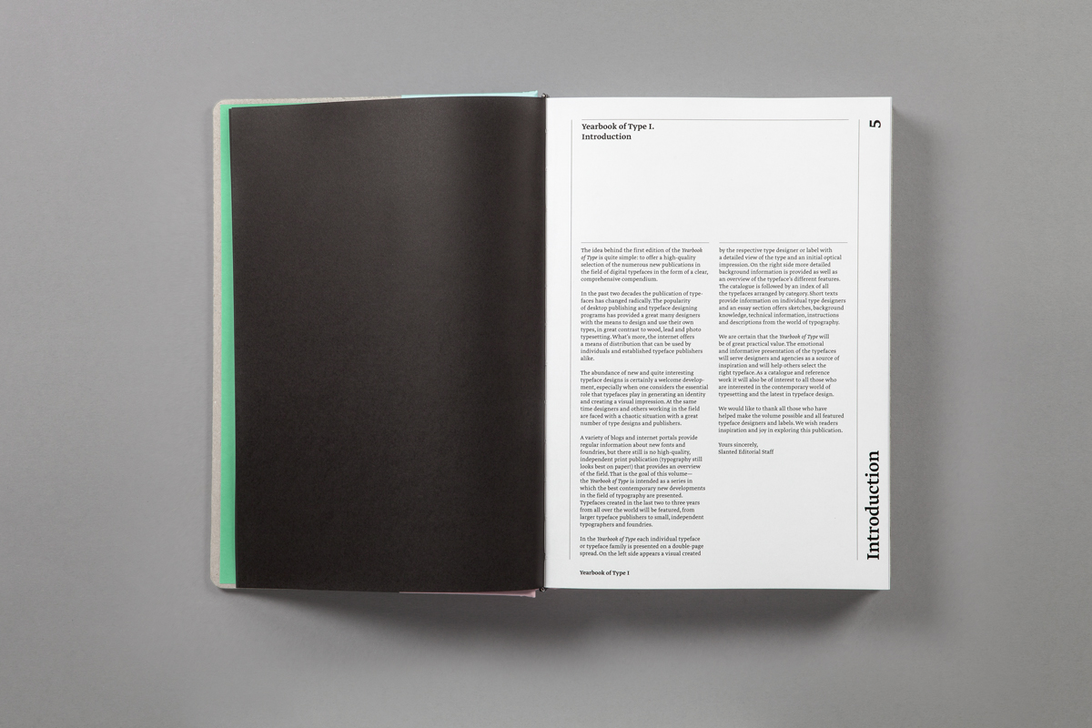
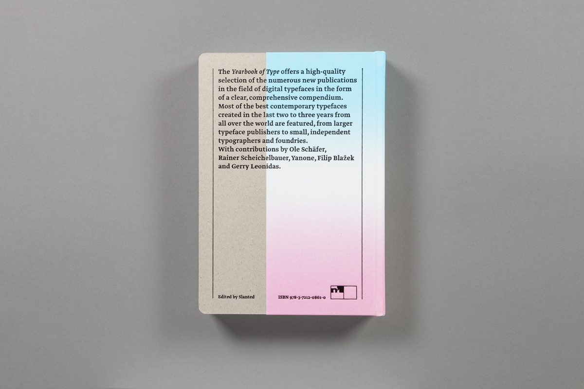
The idea behind the first edition of Yearbook of Type I is quite simple: to offer a high quality selection of the numerous new publications in the field of digital typefaces in the form of a clear, comprehensive compendium.
In the past two decades the publication of typefaces has changed radically. The popularity of desktop publishing and typeface designing programs has provided a great many designers with the means to design and use their own types, in great contrast to wood, lead and photo typesetting. What’s more, the internet offers a means of distribution that can be used by individuals and established typeface publishers alike.
The abundance of new and quite interesting typeface designs is certainly a welcome development, especially when one considers the essential role that typefaces play in generating an identity and creating a visual impression. At the same time designers and others working in the field are faced with a chaotic situation with a great number of type designs and publishers.
A variety of blogs and internet portals provide regular information about new fonts and foundries, but there still is no high-quality, independent print publication (typography still looks best on paper!) that provides an overview of the field. That is the goal of this volume − the Yearbook of Type is intended as a series in which the best contemporary new developments in the field of typography are presented. Typefaces created in the last two to three years from all over the world will be featured, from larger typeface publishers to small, independent typographers and foundries.
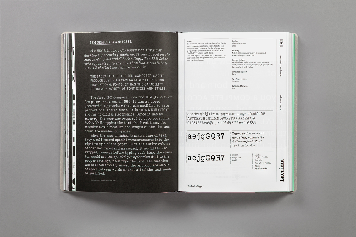
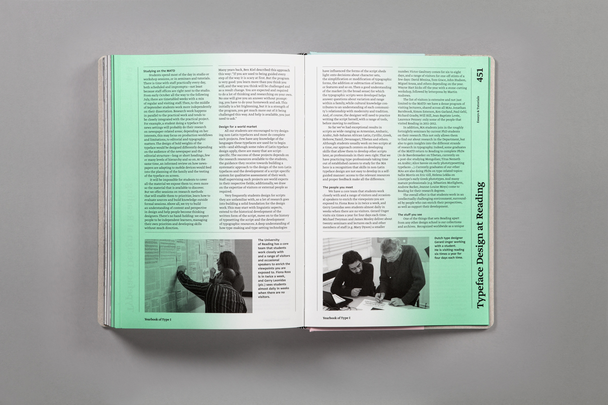
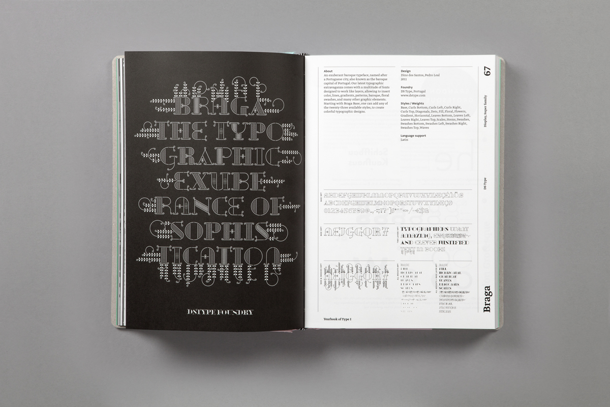
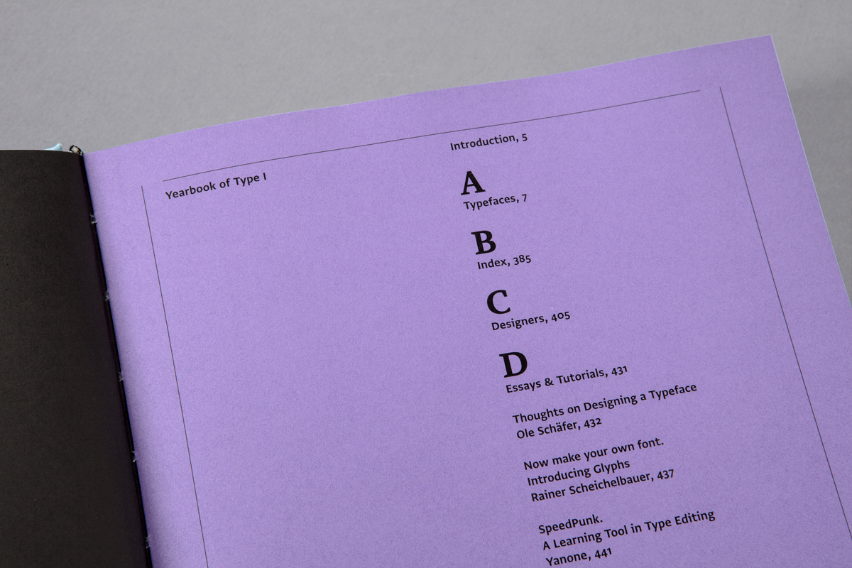
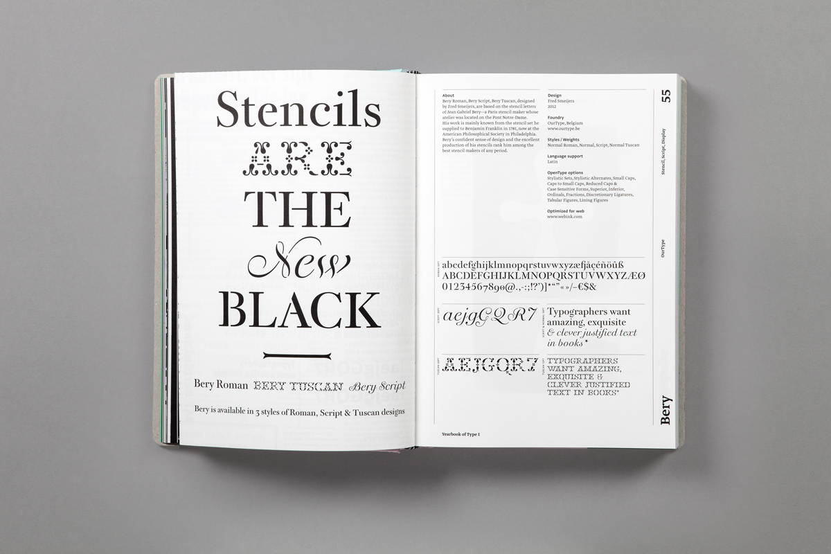
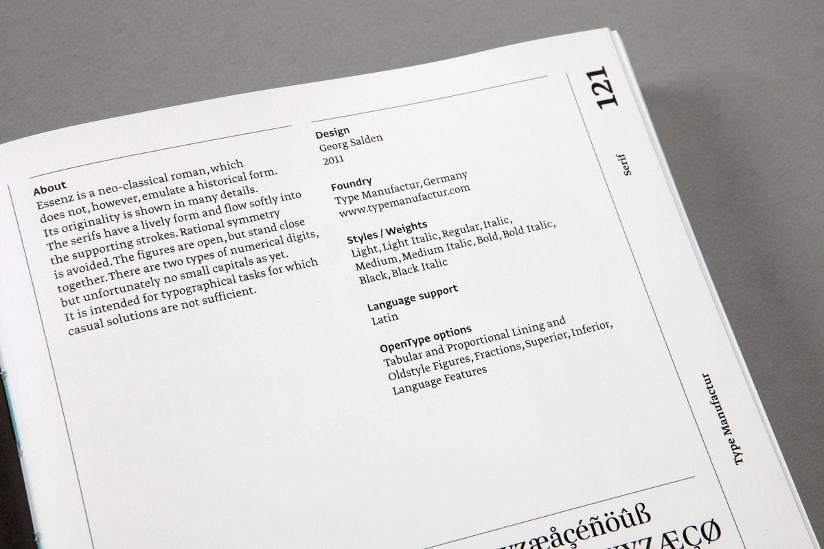
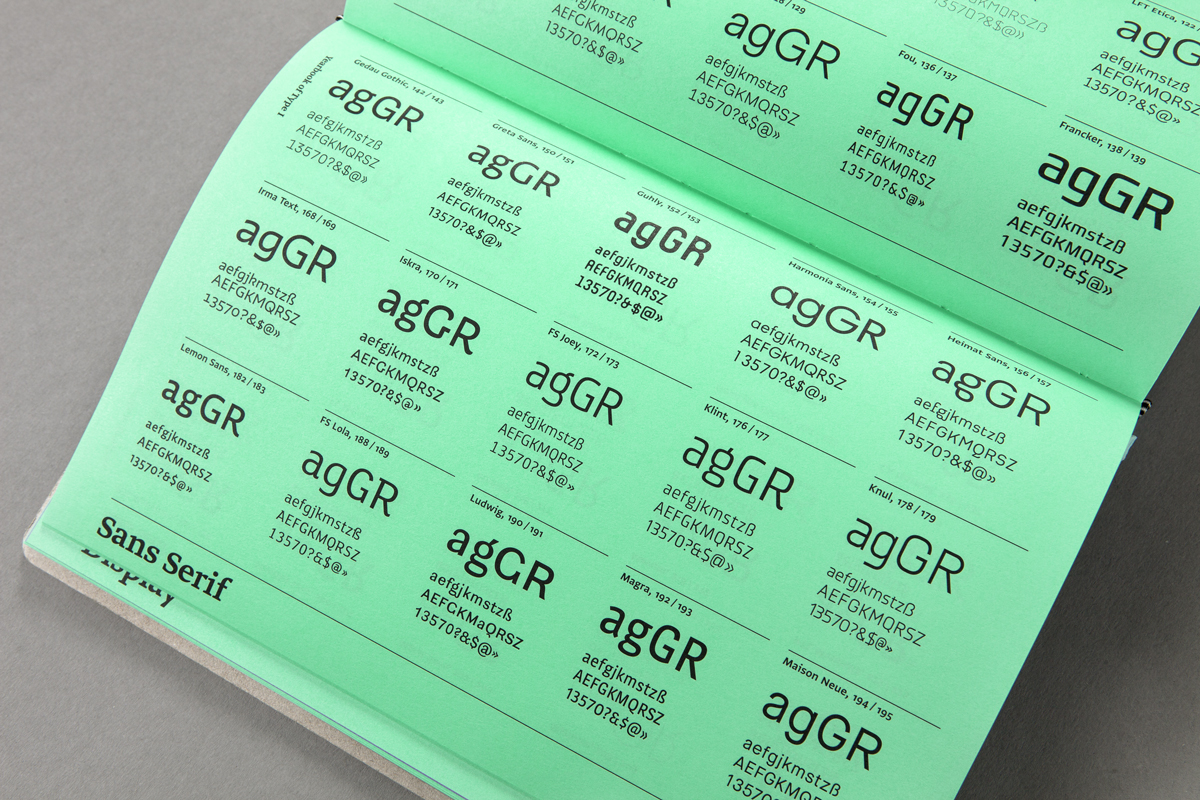
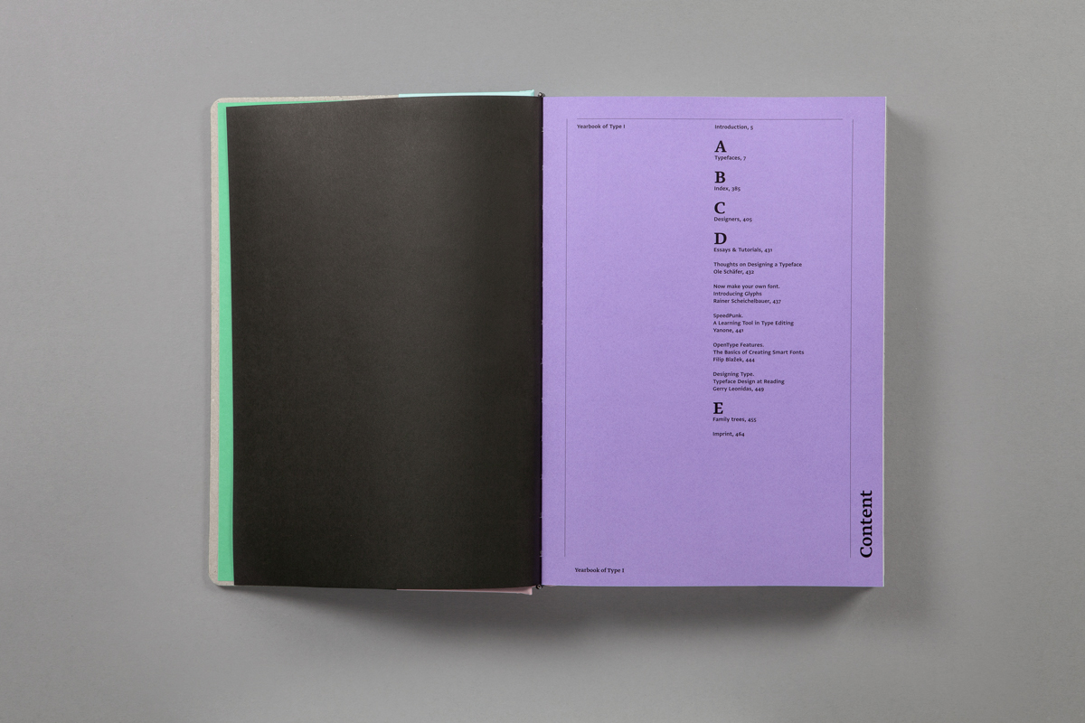
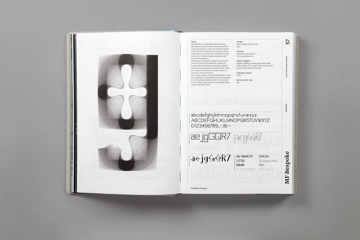
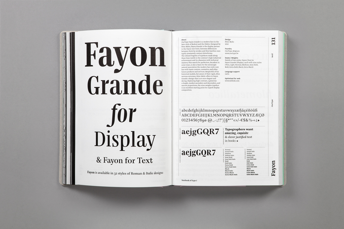
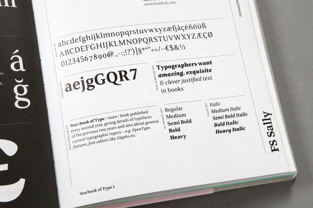
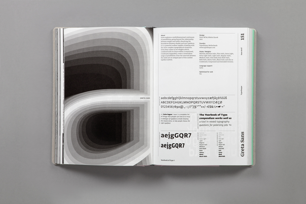
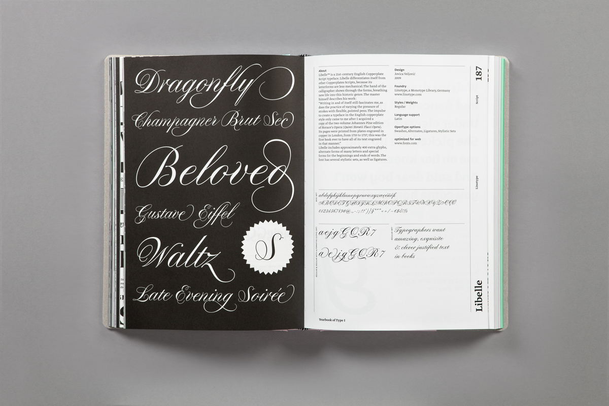
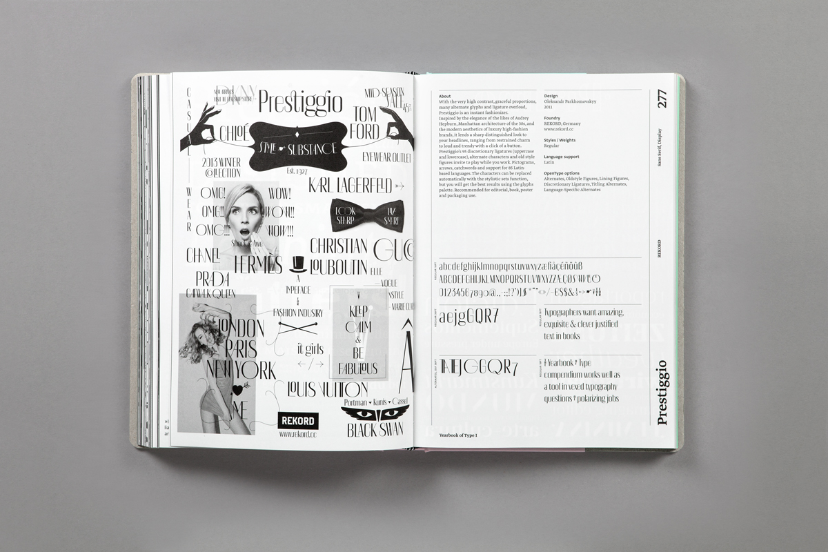
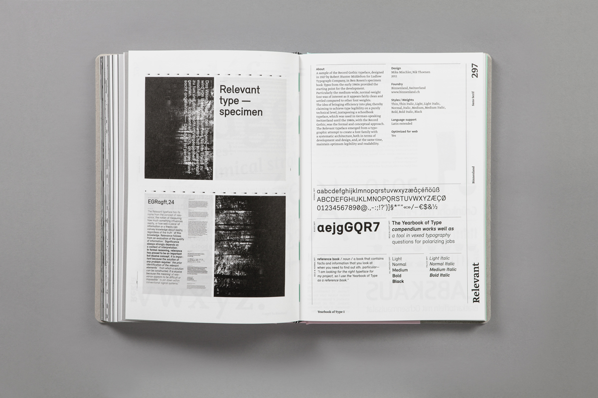
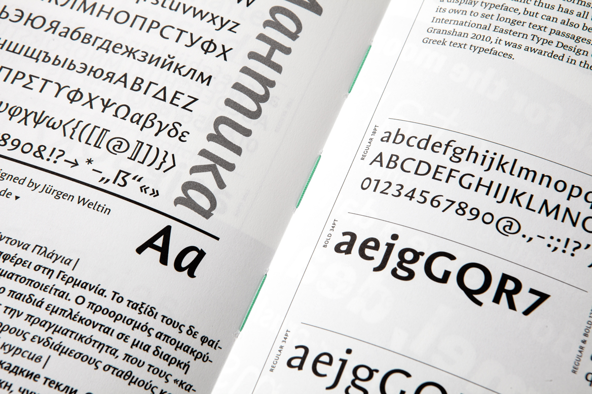
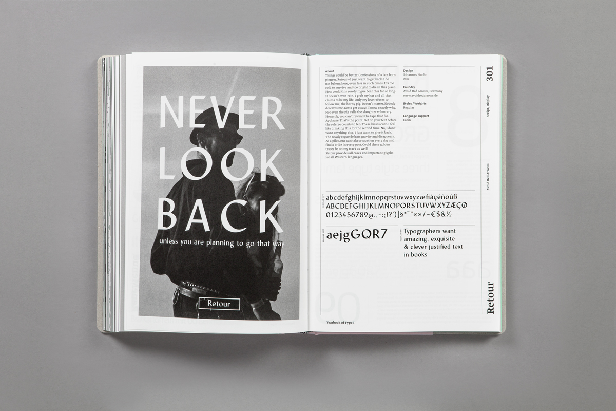
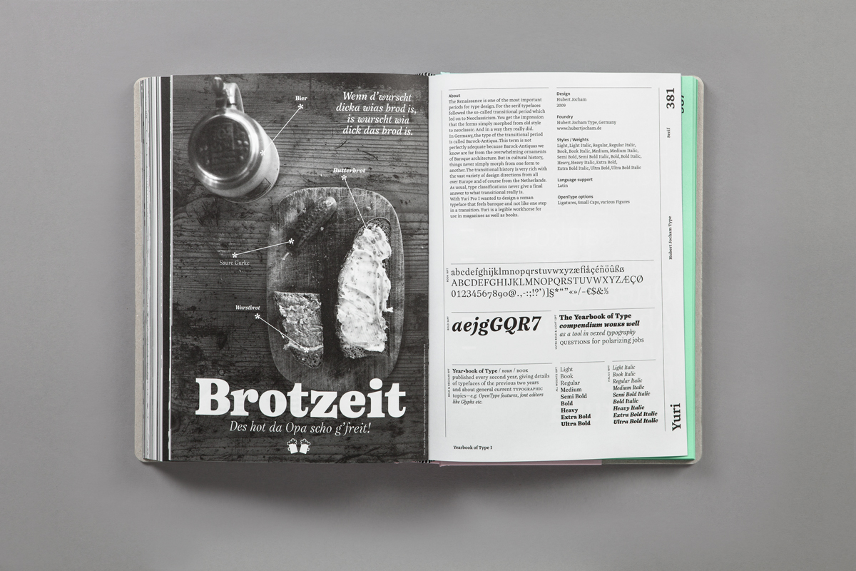
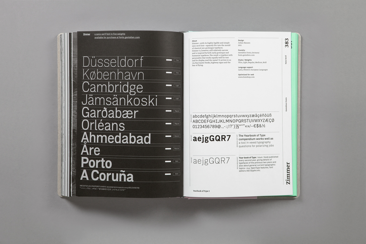
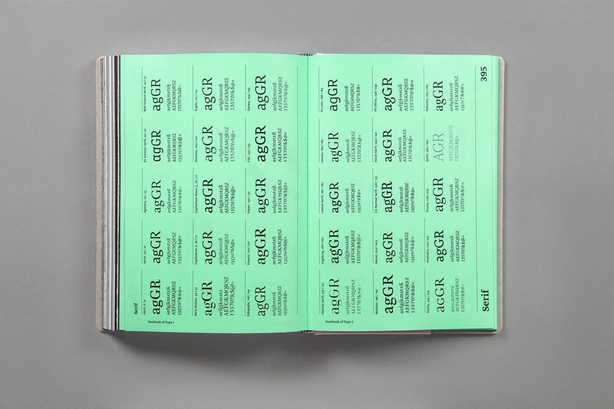
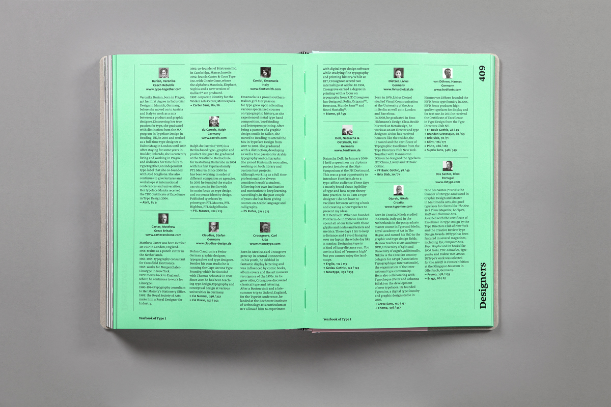
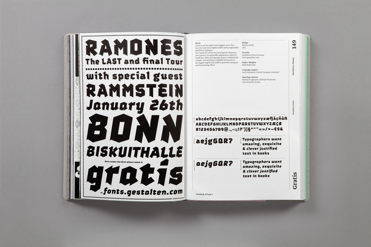
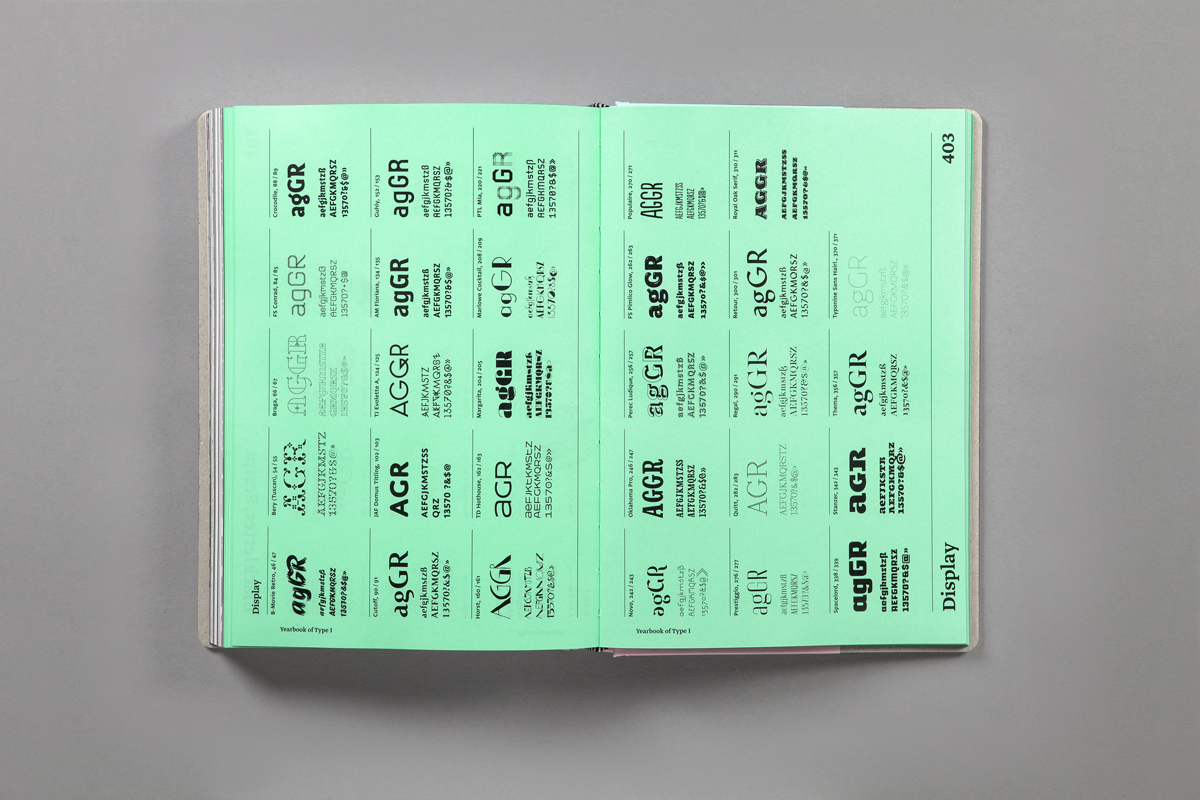
In the Yearbook of Type each individual typeface or typeface family is presented on a double-page spread. On the left side appears a visual created by the respective type designer or label with a detailed view of the type and an initial optical impression. On the right side more detailed background information is provided as well as an overview of the typeface’s different features. The catalog is followed by an index of all the typefaces arranged by category. Short texts provide information on individual type designers and an essay section offers sketches, background knowledge, technical information, instructions and descriptions from the world of typography.
We are certain that the Yearbook of Type will be of great practical value. The emotional and informative presentation of the typefaces will serve designers and agencies as a source of inspiration and will help others select the right typeface. As a catalog and reference work it will also be of interest to all those who are interested in the contemporary world of typesetting and the latest in typeface design.
| Publisher | |
|---|---|
| Release Date | June 2013 |
| Credits |
Editor:
Printer:
Art Direction:
Art Direction:
|
| Identifiers |
ISBN-13:
978-3-7212-0861-0
|
| Original Price | 49.80 EUR |
| Availability | Out of Print |
| Work | |
|---|---|
| Subform | Design Book |
| Topics | Type Design, Typography |
| Language | English |
| Object | |
|---|---|
| Format | Hardcover |
| Dimensions | 16.5 × 24.0 × 3.6 cm |
| Interior | |
|---|---|
| Pages | 464 |
| Material | ZANDERS medley pure, Reflex Premium |
| Exterior | |
|---|---|
| Material | Linen: DUCHESSE black, SURBALIN moiré (Peyer) |
Web references
slanted.delast updated 1121 days ago
Data Contributor: Slanted Publishers
Created by SlantedPublishers
Edited by edcat, SlantedPublishers