
Publisher Note
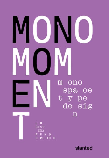
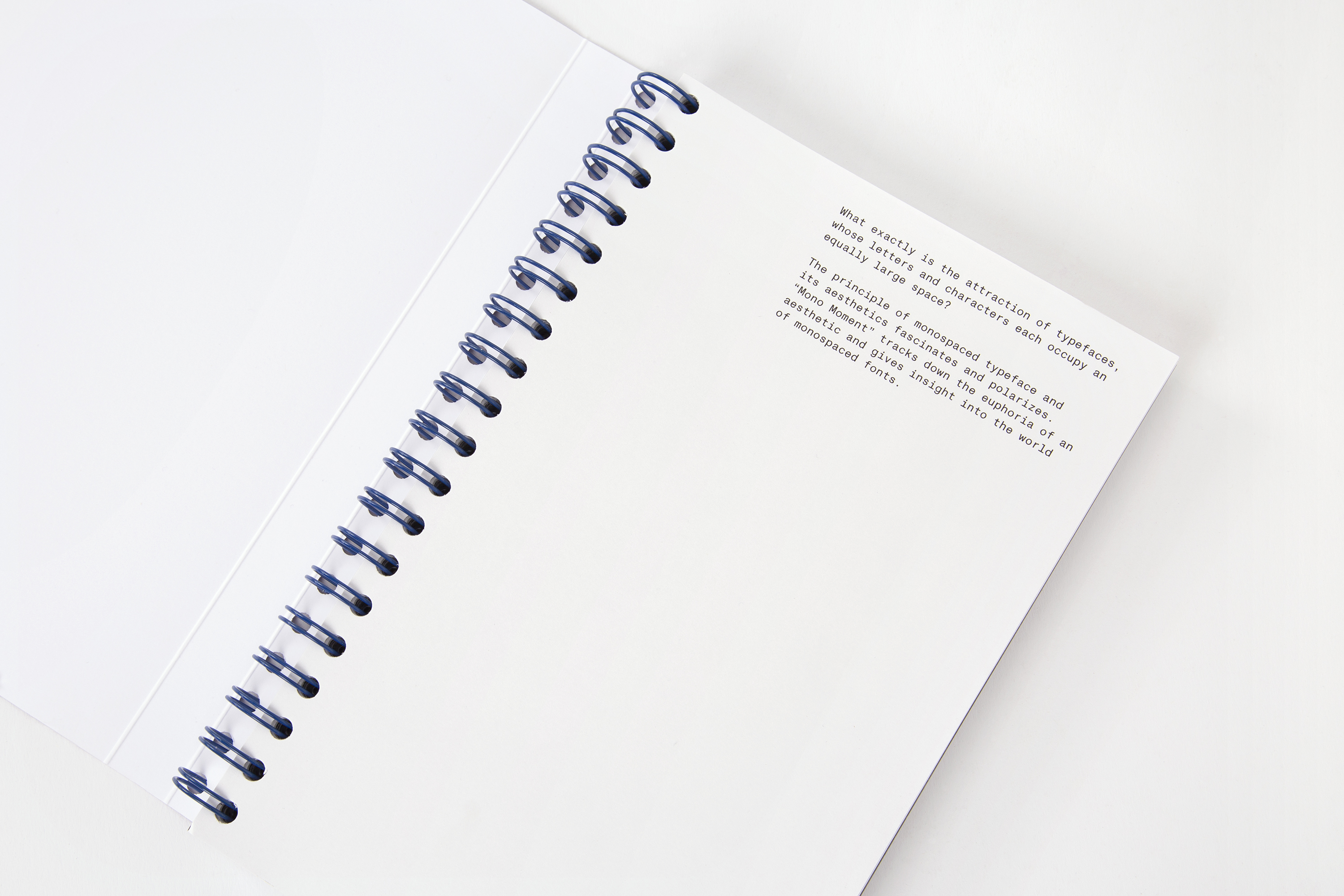
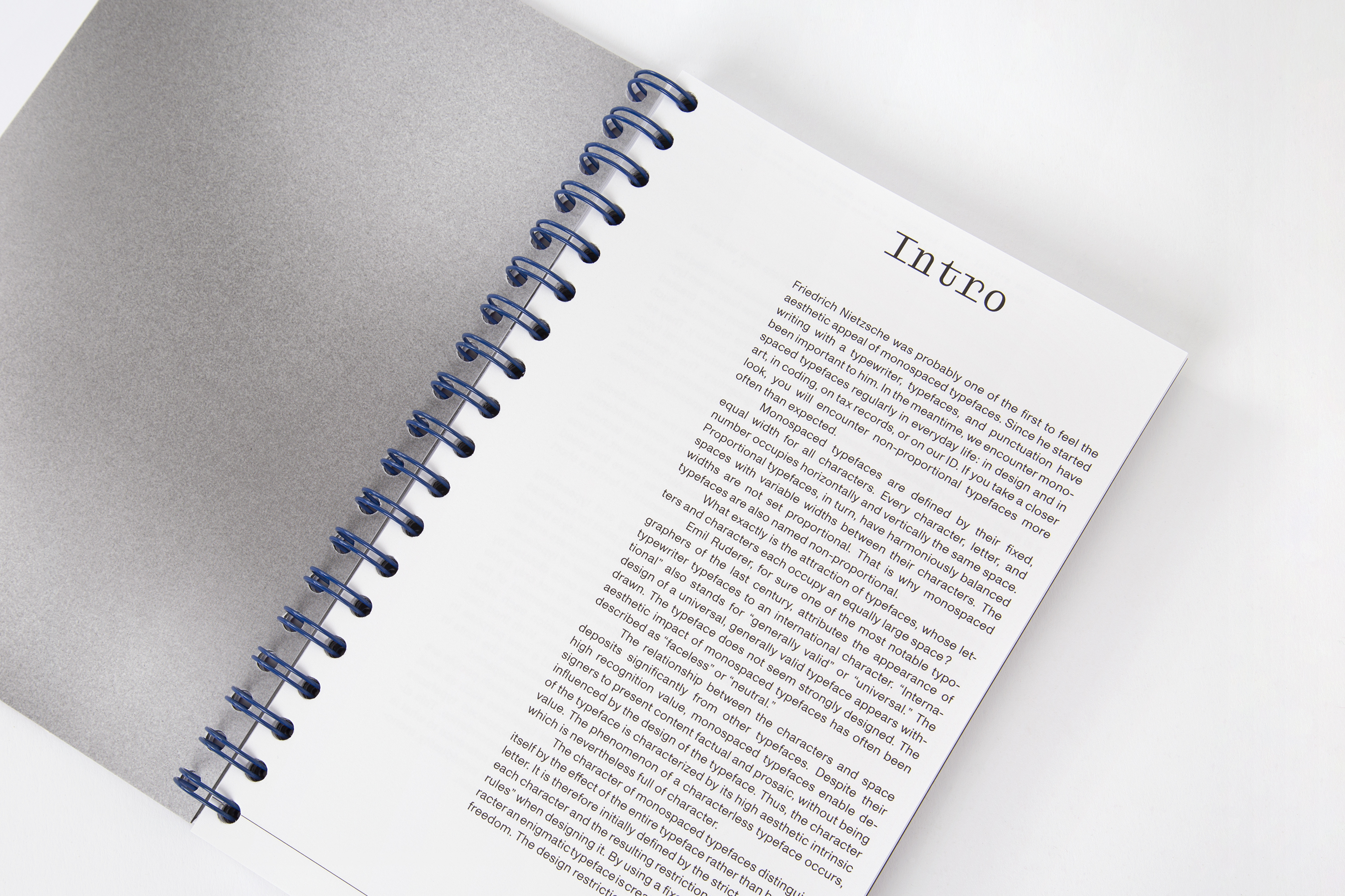
What exactly is the attraction of typefaces, whose letters and characters each occupy an equally large space? The principle of monospaced typefaces and its aesthetics fascinates and polarizes. Mono Moment tracks down the euphoria of an aesthetic and gives insight into the world of monospaced fonts. It is an opportunity to discover monospaced typefaces bundled up. Thus, the book is not only aimed at type designers and fanatics, typographers and designers, but also at people who are interested in typefaces or who get touched or fascinated by it. It can therefore serve as a work of reference for those who have discovered the fascination monospace.
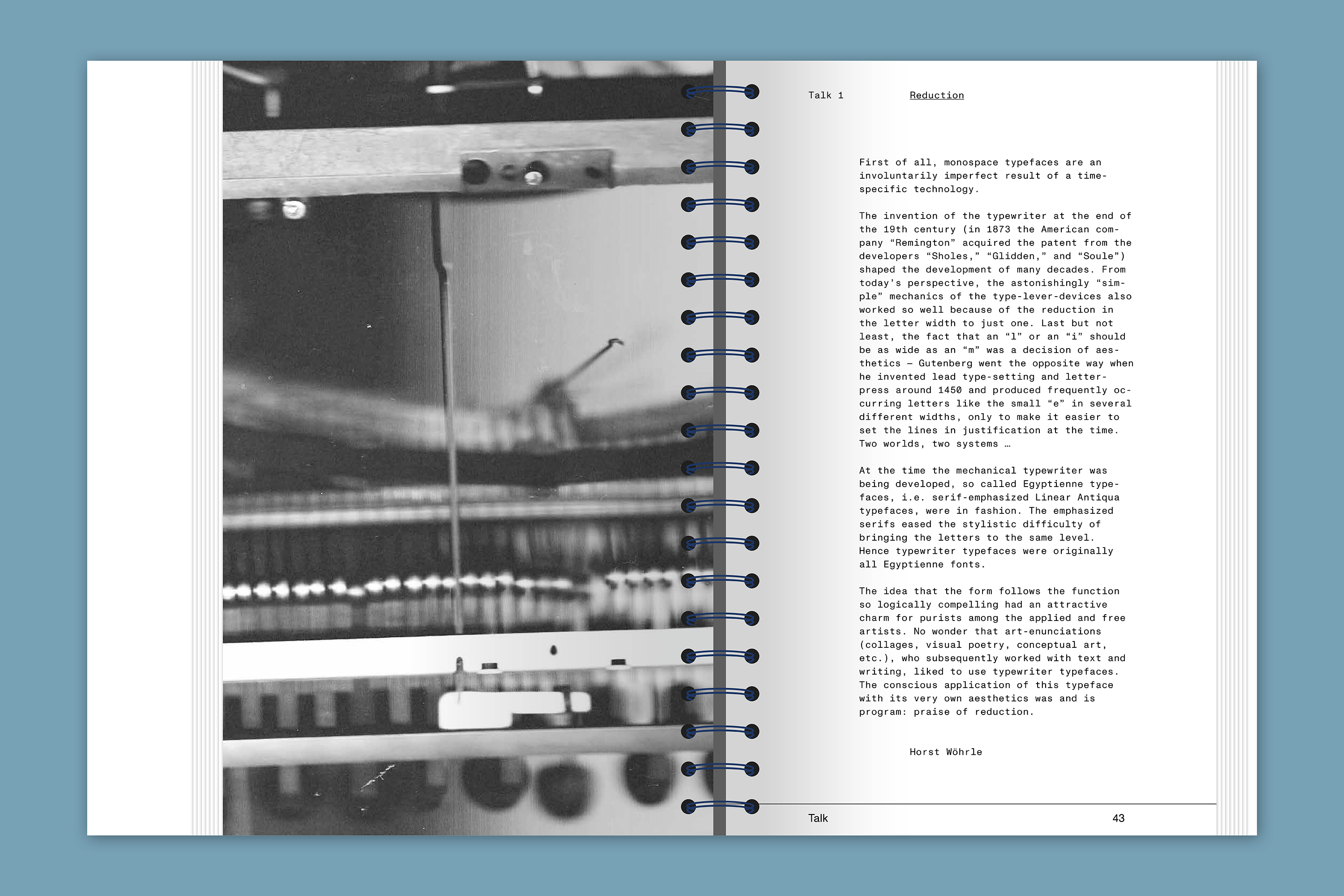
Friedrich Nietzsche was probably one of the first to feel the aesthetic appeal of monospaced typefaces. Since he started writing with a typewriter, typefaces, and punctuation have been important to him. In the meantime, we encounter monospaced typefaces regularly in everyday life: in design and in art, in coding, on tax records, or on our ID. If you take a closer look, you will encounter non-proportional typefaces more often than expected.
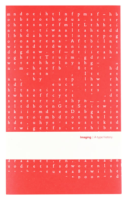
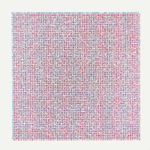
Monospaced typefaces are defined by their fixed, equal width for all characters. Every character, letter, and number occupies horizontally and vertically the same space. Proportional typefaces, in turn, have harmoniously balanced spaces with variable widths between their characters. The widths are not set proportional. That is why monospaced typefaces are also named non-proportional. What exactly is the attraction of typefaces, whose letters and characters each occupy an equally large space?
Due to the increase in typeface production over the past few decades, almost every well-developed font family also has a mono or semi-mono cut. When searching for the word “monospace” on the World Wide Web, countless entries can be found in addition to the results such as “I am looking for a beautiful monospaced font,” “Top Ten Monospace Fonts,” or “Best Monospace Fonts for Coding.” At a moment when it has never been easier to design and publish typefaces, there is a great deal of confusion.
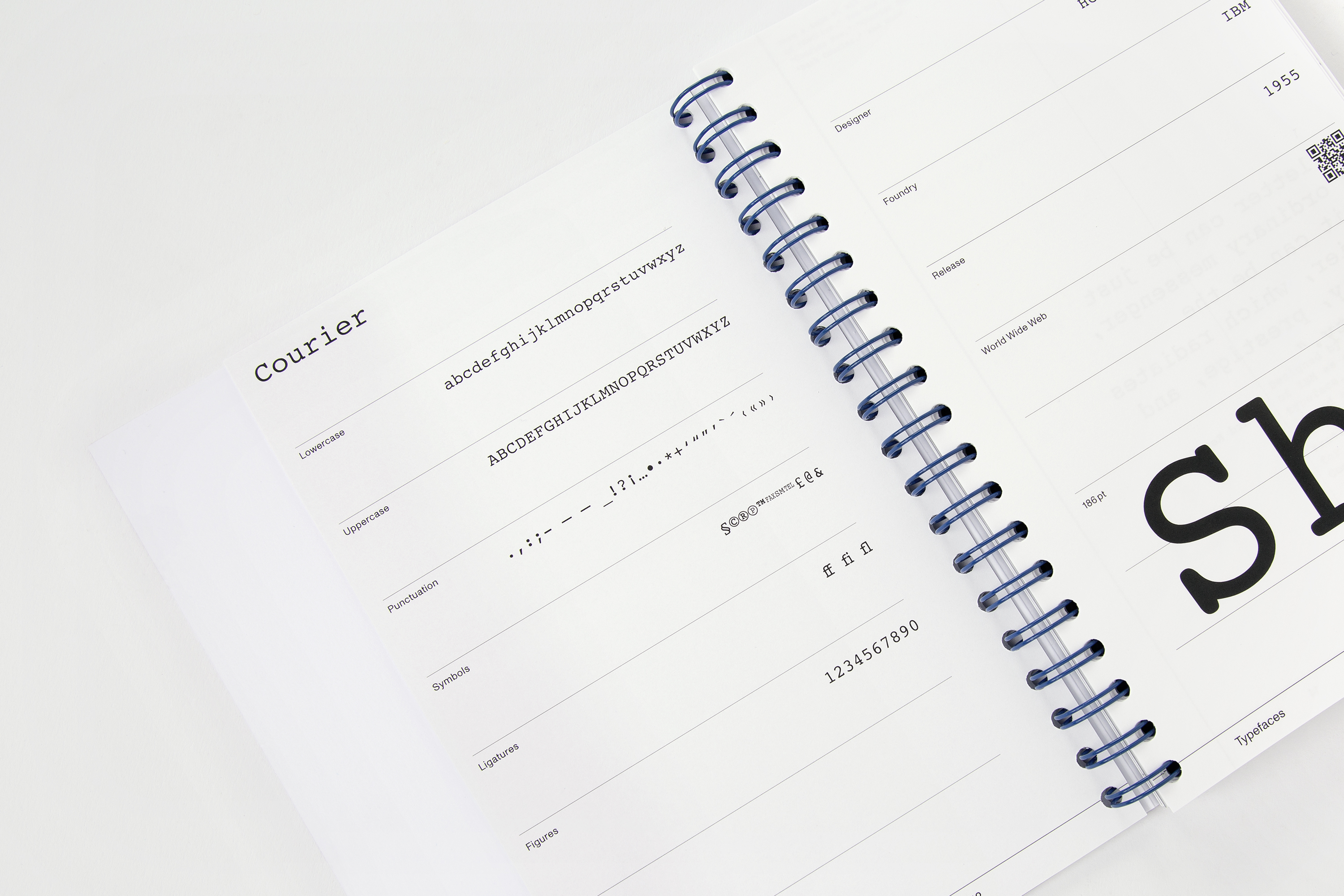
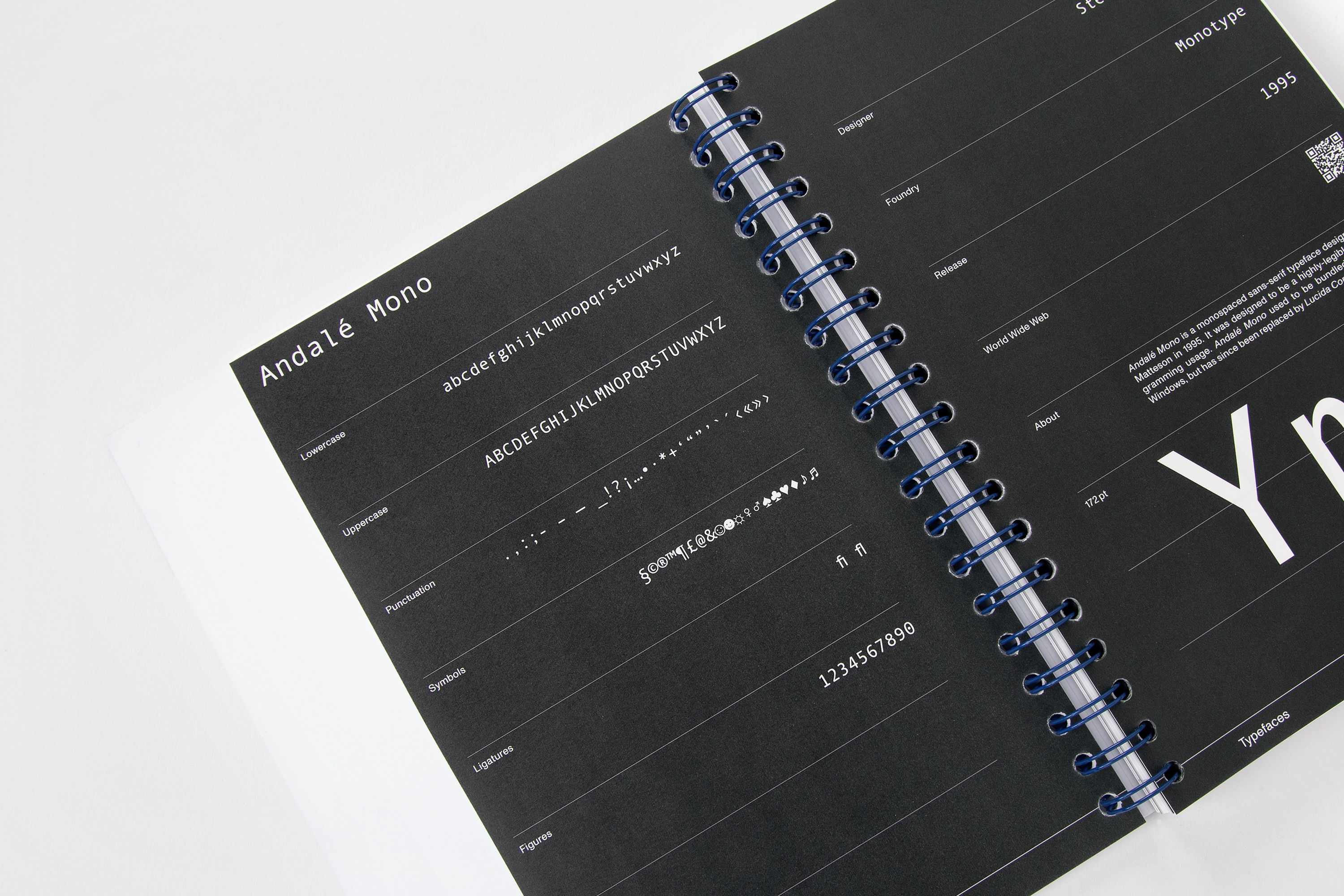
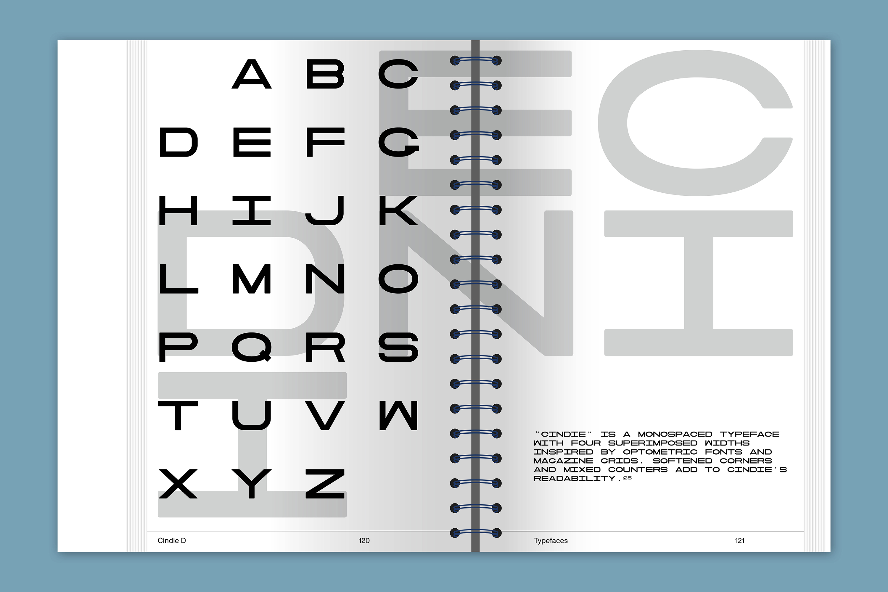
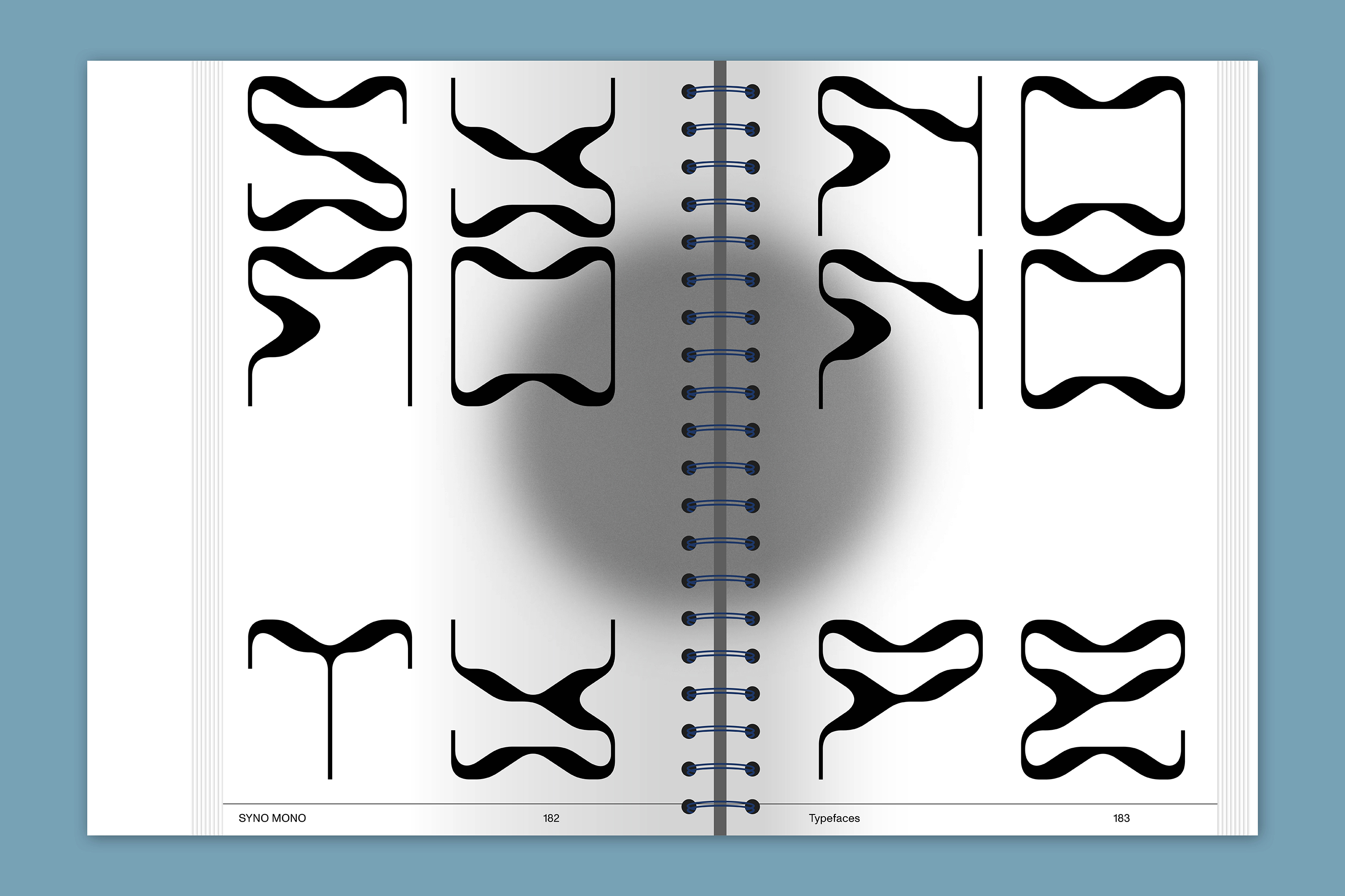
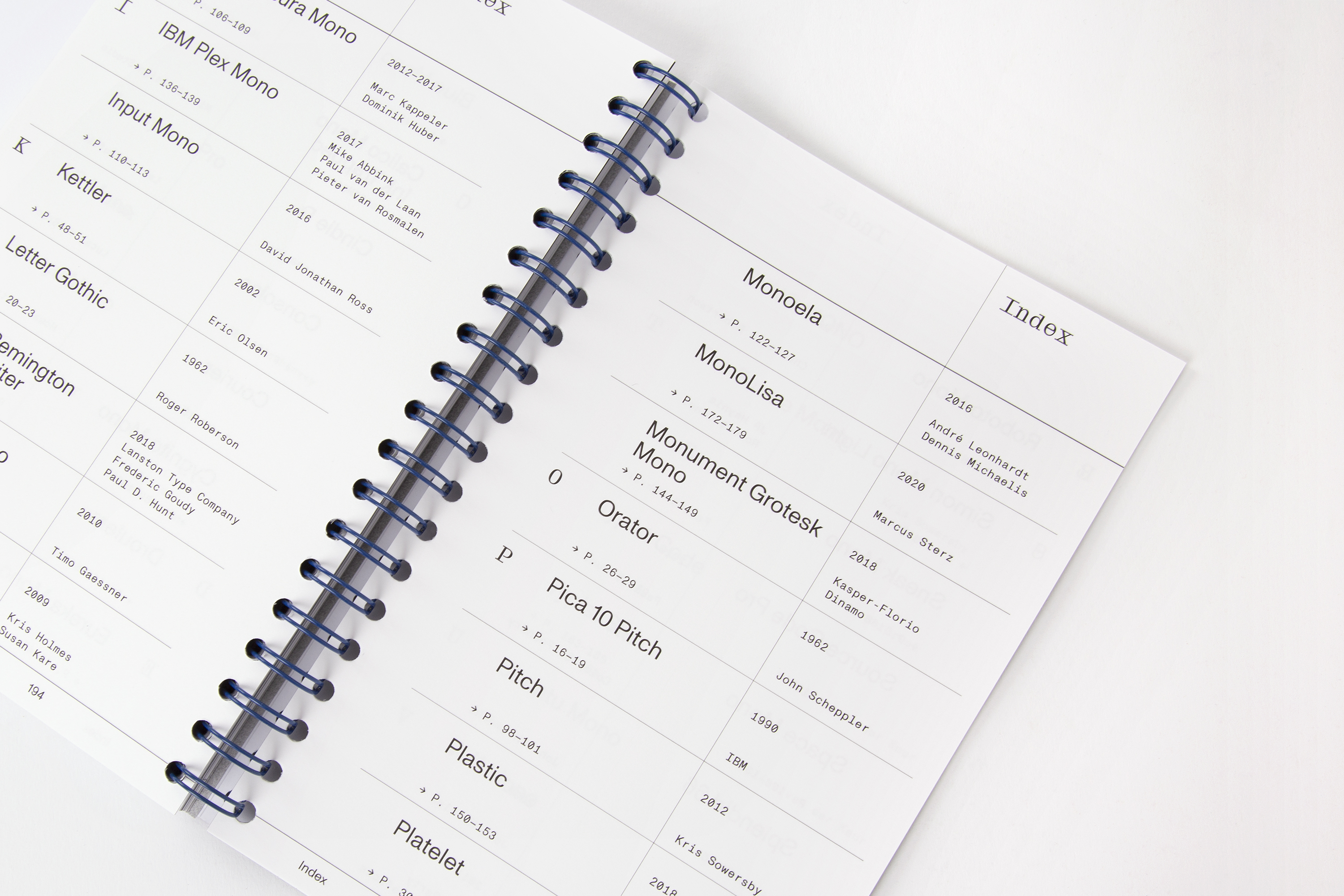
Featured typefaces: Airport Mono, Andal Mono, Anonymus Pro, AO Mono, Aperçu Mono, Atlas Typewriter, Base Mono, Basier Mono, Blue Mono, Calico Mono, Cindie D, Consolas, Courier, Cygnito Mono, Eureka Mono, GT Pressura Mono, IBM Plex Mono, Input Mono, Kettler, Letter Gothic, LTC Remington, Maison Mono, Monaco, Monoela, MonoLisa, Orator, Pica 10 Pitch, Pitch, Plastic, Platelet, Roboto Mono, Simon Mono Light, Sneak Mono, Source Code Pro, Space Mono, Splendid 66, Sudo, Suisse Int’l Mono, SYNO MONO, The Future Mono, TheSans Mono, Typist Code, Typist Slab, Ubuntu Mono, and Vulf Mono.
| Publisher | |
|---|---|
| Release Place | Karlsruhe, Germany |
| Release Date | February 2022 |
| ISBN | 978-3-948440-32-9 |
| Credits |
Designer:
Artist:
|
| Identifiers |
ISBN:
978-3-948440-32-9
|
| Original Price | 15.00 EUR |
| Work | |
|---|---|
| Subform | Typography Book |
| Topics | Graphic Design, Typography |
| Language | English |
Retailers
Slanted Publishers (22.00 €)